보안디자인 기법
Security Design Techniques - 위·변조 방지를 위한 전문 보안 인쇄 및 디자인 기법
.png)
시큐디자인의 추가 보안기법 (Additional Security Features on SecuDesign)
보안디자인은 단순한 그래픽 표현이 아닌, 정밀한 기술과 미학이 결합된 설계 체계입니다. 시큐디자인은 곡선라인기법, 지문라인기법, 다양한 선의 굵기 조절, 돌출 및 라스터 기법, 글로쉬, 라텐트 패턴, 크리스탈 패턴 등과 같은 고도의 보안기술을 통해 복제가 불가능한 보안디자인을 구현합니다.이러한 기법들은 위·변조를 방지하면서도, 상품권·여권·증권 등 각종 유가증권의 품격을 높이는 디자인 요소로 작용합니다.
Security design is not merely a form of graphic expression, but a systematic integration of precision technology and aesthetics.Through advanced techniques such as curved line design, fingerprint line method, variable line width, relief and raster effects, guilloche, latent patterns, and crystal patterns, SecuDesign creates security graphics that are virtually impossible to replicate.These methods not only prevent forgery and counterfeiting but also serve as refined design elements that enhance the visual and technical value of various securities, including gift certificates, passports, and bonds.
Ring Line | 곡선라인 기법
정해진 보안디자인 콘셉트에 맞춰, 문양의 흐름과 전체적인 질감을 먼저 설정합니다. 위·변조를 어렵게 만드는 세밀한 패턴 구조를 연구하고, 선의 굵기, 간격, 반복 비율 등을 세심하게 조정합니다. 기존의 보안 문양이나 해외의 인쇄 자료도 함께 참고하며, 시각적으로 정교하면서도 기술적으로 안정된 결과를 목표로 합니다. 이런 과정을 통해 신뢰성과 진위성을 동시에 갖춘 문양을 완성합니다.
Based on the defined security design concept, we first establish the overall texture and flow of the pattern. We study intricate structures that make forgery and replication difficult, carefully adjusting line thickness, spacing, and repetition ratios. Existing security motifs and international printing references are also reviewed, aiming for a result that is both visually refined and technically secure. Through this process, we create a pattern that conveys authenticity and trust.
.png)
Finger Print Line | 지문라인 기법
일반적인 선을 사람의 지문처럼 바꾸는 기법은 선의 굵기를 균일하게 하지 않고 각 선마다 고유한 모양으로 디자인하는 보안 인쇄 기술입니다. 이 패턴은 미세하고 복잡한 결을 이루어 복사나 스캔 시 선이 끊기거나 왜곡되어 일반 인쇄로는 동일하게 재현되기 어렵습니다. 디자인과 인쇄 과정에서 벡터 기반의 정밀 제어와 종이·잉크·프레스 ���수 검토가 필요합니다. 이 기술은 증권, 인증서, 상품권 등 위·변조 위험이 큰 인쇄물의 실물 진위 판별에 유용합니다. 또한 디지털 검증(예: 시리얼·QR 교차 확인)과 결합하면 이중 보안 체계로서 높은 신뢰성을 제공합니다.
This technique transforms ordinary lines into fingerprint-like patterns by designing each stroke with unique shapes instead of uniform thickness, functioning as a security printing method. The fine, complex textures cause strokes to break or distort when copied or scanned, making faithful reproduction by ordinary printing equipment difficult. Vector-based precision control in design and careful consideration of paper, ink, and press variables in production are required. The method is especially useful for verifying authenticity of high-risk printed items such as securities, certificates, and gift vouchers. When combined with digital verification (e.g., serial number or QR cross-checks), it forms a dual-security system with high reliability.
.png)
Variable Line Width | 다양한 선의 굵기 기법
일정한 굵기의 선이 아니라 가늘어지거나 두꺼워지도록 유동적으로 선을 표현하여 문양을 만들어내는 기법입니다. 이 방식은 선의 굵기 변화와 곡률을 이용해 리듬감 있는 패턴을 형성하며 시각적 복잡성을 높입니다. 미세한 굵기 변화는 복제나 스캔 시 쉽게 왜곡되어 위·변조 방지에도 유리합니다. 디자인 단계에서는 벡터 기반의 정밀 조절과 매끄러운 흐름을 고려한 알고리즘적 접근이 필요합니다. 결과적으로 해당 기법은 미적 완성도와 보안성을 동시에 갖춘 고급 패턴 제작에 적합합니다.
This technique creates patterns by rendering lines dynamically—thinning or thickening—rather than keeping uniform stroke widths. By varying stroke thickness and curvature, it generates rhythmic patterns that increase visual complexity. Subtle width variations distort easily when copied or scanned, making the method effective for anti-counterfeiting. The design phase requires vector-based precision and algorithmic control to ensure smooth, controlled flows. As a result, this approach is well suited for producing high-end patterns that combine aesthetic refinement with security.
.png)
Numismatics and Handamori Relief | 돌출 기법
일정한 간격과 방향성을 가진 선을 활용하여 시각적인 착시를 유도함으로써, 표면이 실제로 돌출된 것처럼 보이게 만드는 기법입니다. 이 기술은 선의 굵기, 간격, 곡률의 미세한 조절을 통해 입체감과 깊이감을 구현하며, 평면 위에서도 3차원적인 효과를 연출할 수 있습니다. 문자, 로고, 이미지 등 다양한 그래픽 요소에 적용할 수 있으며, 특히 브랜드 로고나 인증서 디자인 등에서 고급스럽고 세련된 시각 효과를 부여합니다. 이러한 착시 기반의 돌출 효과는 일반 인쇄로는 쉽게 복제하기 어려워 보안적 측면에서도 유용하게 활용됩니다. 결과적으로 미적 완성도와 보안성을 동시에 확보할 수 있는 고급 디자인 기법이라 할 수 있습니다.
This technique uses lines arranged with consistent spacing and directional flow to create a visual illusion of raised surfaces. Through subtle variations in stroke thickness, spacing, and curvature, it achieves a sense of depth and dimensionality, producing a three-dimensional look on a flat surface. It can be applied to text, logos, and images, providing a refined and sophisticated appearance, especially suitable for branding or certificate designs. Because this embossed illusion is difficult to reproduce with ordinary printing methods, it also offers security benefits against counterfeiting. Ultimately, it is a premium design method that combines aesthetic excellence with functional protection.
.png)
Guilloche Creator | 글로쉬
Guilloche는 화폐, 주권, 상품권 등과 같은 유가증권 디자인에서 가장 널리 사용되는 핵심 보안 기법 중 하나입니다. 이 기법은 단순한 디자인 기술이 아닌 정교한 수학적 계산과 알고리즘을 기반으로 복잡한 곡선 패턴을 생성하여, 위·변조를 방지하는 데 매우 효과적입니다. Guilloche 문양은 일정한 규칙성과 동시에 자연스러운 선의 흐름을 가지며, 그 미세한 차이만으로도 정품과 위조품을 구분할 수 있습니다. 또한 Special Raster(특수 라스터) 기법과 함께 사용될 때, 선의 두께·간격·곡률 등의 정밀한 조합을 통해 고품질의 보안 디자인을 완성할 수 있습니다. 복사나 스캔 등 일반 인쇄 장비로는 동일한 선형 구조를 재현하기 어려워, 시각적으로도 높은 보안성을 제공합니다. 따라서 Guilloche는 예술성과 기술적 정밀함을 동시에 요구하는 고도의 보안 인쇄 기법이라 할 수 있습니다.
Guilloche is one of the most important and widely used security techniques in the design of currency, stock certificates, and other financial documents. Rather than being a purely artistic design, it is based on precise mathematical formulas and algorithms that generate intricate curved line patterns, making counterfeiting extremely difficult. Each Guilloche pattern features a balance between geometric regularity and natural fluidity, allowing even subtle differences to distinguish genuine items from forgeries. When combined with Special Raster techniques, the precise coordination of line thickness, spacing, and curvature produces a highly sophisticated level of security design. Because such detailed line structures cannot be accurately reproduced by ordinary printing or scanning, it provides strong visual protection against duplication. Thus, Guilloche represents an advanced form of security printing where artistic elegance and mathematical precision converge.
.png)
Path Definition | 흐름에 따라 패턴이 변화
하나의 라인에서 특정 값(파라미터)의 변화에 따라 흐름과 형태가 달라지도록 설계하는 기법입니다. 이 방식은 선의 굵기, 곡률, 간격 등의 수학적/알고리즘적 조절로 다양한 시각적 변화를 만들어냅니다. 주로 배경 패턴이나 디자인의 코너, 경계선 등 반복적이면서도 미묘한 변화를 주고 싶은 영역에 활용됩니다. 선의 흐름이 연속적이면서도 규칙적으로 변하기 때문에 육안으로는 자연스러운 무늬로 보입니다. 그러나 복사나 스캔 과정에서는 미세한 흐름 변화가 손실되어 정교한 재현이 어렵기 때문에 위조 방지 효과가 높습니다. 디자인 단계에서는 파라미터 값의 설정과 벡터 기반의 정밀 제어가 필수적이며, 인쇄 공정 변수도 함께 고려해야 합니다. 결과적으로 이 기법은 심미성과 보안성을 동시에 충족시키는 고급 보안 패턴 제작에 유용합니다.
This technique involves altering the flow and shape of a single continuous line based on specific variable parameters. By mathematically or algorithmically adjusting line thickness, curvature, and spacing, it creates intricate and visually dynamic patterns. It is primarily used in background textures, corner embellishments, and border areas where subtle yet continuous variations enhance the design. Although the pattern appears smooth and natural to the naked eye, the micro-level variations make it extremely difficult to replicate through ordinary printing or scanning. Such delicate transitions are often lost during reproduction, providing excellent anti-counterfeiting protection. In the design process, precise control of vector geometry and parameter values is essential, along with careful consideration of printing conditions. Ultimately, this method effectively combines aesthetic refinement with robust security functionality, making it ideal for high-level security pattern applications.
.png)
1 or 2 라인 기법
이미지나 문자를 구성하는 라인이 단일한 흐름에서 두 갈래로 갈라졌다가 다시 하나로 합쳐지는 방식으로 설계되는 보안 인쇄 기법입니다. 이 기술은 선의 분리와 결합이 자연스럽게 반복되며, 복잡한 형태의 유기적 패턴을 만들어 냅니다. 그 과정에서 선의 두께, 간격, 곡률 변화가 정밀하게 제어되어 시각적으로도 아름답고 정교한 인쇄 효과를 제공합니다. 일반 복사기나 스캐너로는 이러한 세밀한 선의 구조와 흐름을 정확히 재현하기 어려워 위조나 복제가 거의 불가능합니다. 또한 이 기법은 이미지의 외곽선뿐 아니라 문자의 내부나 배경 영역에도 적용되어 전체적인 디자인의 보안성을 강화합니다. 보안 문서, 여권, 상품권, 증서 등 위조 위험이 높은 인쇄물에 자주 활용됩니다. 특히 다른 보안 요소(예: Guilloche, Micro Text, Invisible Ink)와 결합될 경우 더욱 강력한 복제 방지 효과를 발휘합니다. 결과적으로 이 기법은 기술적 정밀함과 예술적 감각이 결합된 고품질 보안 인쇄 표현 방식이라 할 수 있습니다.
This security printing technique is designed so that the lines forming an image or text split into two branches and then merge back into one continuous flow. The process of dividing and recombining lines creates complex, organic patterns with a sense of movement and depth. During this process, the thickness, spacing, and curvature of the lines are precisely controlled, producing a visually elegant and intricate print. Such fine structures are nearly impossible to reproduce accurately using ordinary copiers or scanners, providing excellent protection against forgery. The technique can be applied not only to the outlines of images but also to the inner or background areas of characters, enhancing overall security. It is widely used in high-security printed materials such as certificates, passports, gift vouchers, and stock documents. When combined with other security features — such as Guilloche, Micro Text, or Invisible Ink — it provides even greater anti-counterfeiting power. Ultimately, this method represents a high-level fusion of technical precision and artistic craftsmanship in modern security printing.
.png)
Various text size | 문자의 다양한 크기 변화
라인으로 이루어진 글씨나 문양이 일정한 수학적 값의 변화에 따라 크기나 굵기가 미세하게 조절되는 보안 인쇄 기법입니다. 이 방식은 각 선이 일정한 두께로 유지되지 않고, 특정 좌표나 알고리즘에 따라 선의 폭이 넓어지거나 좁아지도록 설계됩니다. 그 결과 육안으로는 자연스러운 그래픽처럼 보이지만, 확대 시 선의 미세한 변화가 드러나 위조를 어렵게 만듭니다. 특히 이러한 변화는 복사나 스캔 과정에서 정확히 인식되지 않아, 인쇄물의 복제 방지 효과를 극대화합니다. 이 기술은 문자, 로고, 서명 등의 요소에 적용되어 개별적인 고유 패턴을 형성합니다. 또한 Guilloche나 Micro Text 등 다른 보안 요소와 함께 사용될 경우 더욱 강력한 복합 보안 효과를 발휘합니다. 결과적으로 단순한 시각적 표현을 넘어, 데이터 기반의 정밀한 라인 컨트롤을 통해 고급 보안 인쇄의 핵심 기술로 활용됩니다.
This technique involves letters or patterns composed of lines whose size or thickness subtly adjusts according to specific mathematical values. Each line does not maintain a constant width; instead, its thickness expands or contracts dynamically based on coordinates or algorithmic parameters. As a result, the image appears natural to the naked eye, but when magnified, fine variations in the lines become visible — making counterfeiting extremely difficult. During copying or scanning, these micro-level changes are not captured accurately, maximizing the anti-forgery effect. This method is often applied to text, logos, and signatures to create distinctive, individualized security patterns. When combined with other features such as Guilloche or Micro Text, it enhances layered security performance even further. Ultimately, it transcends mere visual design, serving as a core technology in advanced security printing through data-driven precision line control.
.png)
Micro text | 마이크로 텍스트
서체를 이용하여 표현하는 방법으로, 육안으로 식별하기 어려운 극미세 글씨(대략 0.3pt~1pt)를 연속적으로 배열해 선이나 곡선을 형성하는 기법입니다. 이 방식은 개별 글자의 형태가 미세하여 육안으로는 단일 선처럼 보이지만 확대하면 텍스트로 판독 가능한 구조를 가집니다. 미세 글씨는 복사나 스캔 과정에서 흐려지거나 끊겨 재현이 어렵기 때문에 위·변조 방지에 매우 유리합니다. 디자인 단계에서는 글꼴 선택, 자간·행간의 정밀 제어 및 벡터 기반 출력 설정이 필수적이며 인쇄 공정의 품질 관리가 중요합니다. 종이 섬유, 잉크 확산, 도트 게인 등의 인쇄 변수까지 고려해야 하며 고해상도 인쇄 장비와 적절한 잉크가 요구됩니다. 주로 증권, 인증서, 고급 상품권, 보안라벨 등의 영역에 적용되며 다른 보안 요소(Guilloche, 미세문자, 홀로그램 등)와 결합하면 효과가 배가됩니다. 결과적으로 극미세 서체 기반 패턴은 시각적 정교함과 실무적 복제 저항성을 동시에 제공하는 고급 보안 인쇄 기법입니다.
This method utilizes typography to create lines or curves composed of extremely small letters (approximately 0.3pt to 1pt), which are difficult to distinguish with the naked eye. While these micro letters appear as a single continuous line when viewed normally, magnification reveals that they are composed of readable text. Because such fine characters blur or break during copying or scanning, this technique provides strong resistance against forgery and duplication. In the design process, careful control of font selection, letter spacing, line spacing, and vector-based output settings is essential, along with precise printing quality management. Printing variables such as paper fiber texture, ink diffusion, and dot gain must also be considered, requiring high-resolution printing equipment and specialized inks. It is mainly applied to securities, certificates, premium gift vouchers, and security labels, and when combined with other security features (such as Guilloche, microtext, or holograms), its effectiveness is further enhanced. Ultimately, microtype-based line patterns offer both visual sophistication and practical anti-counterfeiting performance, making them a high-end technique in modern security printing.
.png)
Latent Pattern | 라텐트 패턴
도형의 방향을 엇갈리게 배치하는 기법으로, 반복 패턴의 규칙성을 깨뜨려 복사기나 스캐너가 패턴을 정확히 읽지 못하게 만듭니다. 이 방식은 동일한 도형을 다양한 각도와 반전, 미세한 위치 편차로 배열하여 기계적 패턴 인식 알고리즘을 혼란시킵니다. 육안으로는 자연스럽고 일관된 무늬처럼 보이지만 복제 과정에서는 모듈화된 패턴이 깨져 원본과 다른 결과가 나오게 됩니다. 특히 바코드·QR 인식이나 자동 패턴 매칭 기술을 회피하는데 유용하며, 위·변조 방지용 배경이나 경계 장식에 적합합니다. 디자인 단계에서 방향 편차의 규칙성(임의성)과 반복 주기, 도형 간 간격을 정밀하게 조정해야 효과가 극대화됩니다. 인쇄 공정에서는 잉크 확산, 종이 텍스처, 해상도에 따른 영향도 함께 고려해야 하며 고해상도 출력이 권장됩니다. 다른 보안 요소(예: 미세문자, Guilloche, 홀로그램)와 병용하면 복제 저항성이 더욱 강화됩니다. 결과적으로 도형 방향 엇갈림 기법은 심미성과 실용적 보안성을 동시에 제공하는 효과적인 위조 방지 수단입니다.
This technique involves designing geometric shapes with alternating or opposing directions to disrupt the regularity of patterns, preventing copiers or scanners from accurately reading them. By varying the orientation, rotation, and slight positional offsets of identical shapes, the method confuses automated pattern recognition algorithms used in duplication devices. To the naked eye, the design appears as a natural and consistent pattern, but during reproduction, the modular structure breaks down, resulting in a distorted or mismatched copy. It is particularly effective for avoiding barcode or QR code pattern detection and is often used in background textures or border decorations for security documents. During the design phase, careful adjustment of direction randomness, repetition intervals, and spacing between shapes is crucial to maximize effectiveness. In printing, factors such as ink spread, paper texture, and resolution must be considered, and high-resolution printing is recommended for best results. When combined with other security elements—such as microtext, Guilloche, or holograms—this technique further enhances resistance to forgery. Ultimately, the alternating direction pattern technique provides both aesthetic sophistication and practical security, making it a highly effective anti-counterfeiting method.
.png)
Crystal Pattern | 크리스탈 패턴
한 방향의 선이 아니라 다양한 방향의 선들이 모여 하나의 돌출된 이미지나 문자 형태를 만들어내는 기법입니다. 이 방법은 선의 방향성과 배열을 변화시켜 표면에 입체감과 텍스처를 부여하며, 단일 방향성 돌출 문자와는 다른 시각적 깊이를 구현합니다. 서로 다른 각도의 선들이 만나 생기는 음영과 하이라이트는 실제로 도드라진 듯한 착시 효과를 유도합니다. 디자인 단계에서는 선의 길이, 밀도, 각도 분포를 정밀하게 설계해 원하는 돌출 형태를 형성해야 합니다. 특히 Special Raster와 결합하면 라인 간의 미세한 간격과 그라데이션이 강화되어 돌출 효과가 더욱 뚜렷해집니다. 복제나 스캔 시에는 다양한 방향성으로 인해 패턴의 동시 재현이 어려워 위조 방지 효과가 크게 향상됩니다. 이 기법은 로고, 인증문구, 패키지 아트워크, 보안문서의 배경 등 광범위하게 적용할 수 있습니다. 인쇄 시에는 잉크 확산, 종이 결, 해상도 등 물리적 요소를 고려한 파일 준비와 품질 관리가 필수적입니다. 결과적으로 다방향 라인 기반 돌출 기법은 미적 완성도와 보안성을 동시에 만족시키는 고급 표현 방식입니다. 고도의 기술적 제어와 예술적 감각이 결합되어야 구현 가능한 전문 보안·디자인 솔루션이라 할 수 있습니다.
This technique uses lines oriented in multiple directions, rather than a single direction, to create the appearance of raised images or text. By varying the direction and arrangement of lines, it adds depth and texture to the surface, producing a sense of dimensionality distinct from standard embossed lettering. The intersection of lines at different angles generates highlights and shadows, resulting in an optical illusion of physical elevation. During the design stage, precise control over line length, density, and angular distribution is essential to form the intended embossed shape. When combined with Special Raster techniques, the micro-spacing and gradient transitions between lines are enhanced, further amplifying the three-dimensional effect. Because the lines move in various directions, copying or scanning the pattern becomes extremely difficult, providing excellent anti-counterfeiting protection. This method can be applied to logos, authentication marks, package artwork, and background patterns in secure documents. For printing, considerations such as ink spread, paper texture, and resolution must be carefully managed to maintain visual precision. Ultimately, the multi-directional line relief technique achieves both aesthetic refinement and strong security performance. It represents a sophisticated fusion of technical precision and artistic craftsmanship, serving as a professional-grade solution in modern security and design applications.
.png)
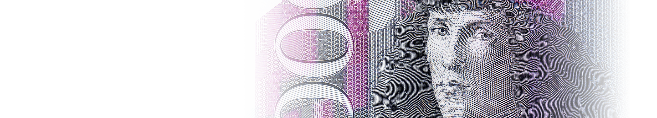
Special Raster | 그림이 선으로 변화되는 기법
그림이나 문자를 일정한 굵기와 간격의 선(Line)으로 표현하는 고급 보안 인쇄 기법으로, 주로 상품권, 주권, 화폐, 여권 등 유가증권류에서 사용되는 대표적인 기술입니다. 이 기법은 단순한 그래픽 표현이 아닌, 정밀한 선들의 조합으로 인물, 건물, 동물, 상징적인 패턴 등을 사실적으로 묘사합니다. 각 선은 일정한 규칙에 따라 두께나 간격이 미세하게 변화하며, 육안으로는 자연스러운 음영과 입체감을 형성합니다. 복제나 스캔 시에는 선의 미세한 구조가 깨지거나 흐려져 원본처럼 재현할 수 없기 때문에 위조 방지 효과가 탁월합니다. 특히 Special Raster 기법은 이러한 라인 표현 방식을 한층 발전시켜, 인쇄 시 고해상도의 조밀한 선들이 서로 맞물리며 세밀한 질감을 만들어냅니다. 이는 인타그리오(Intaglio, 돌출인쇄)와 함께 사용될 때 최고의 보안성과 입체적 표현력을 발휘합니다. 인타그리오 인쇄는 종이에 잉크를 압착시켜 물리적인 요철을 남기므로, 시각적 효과뿐만 아니라 촉각적인 진위 확인이 가능합니다. Special Raster 작업을 위해서는 일반 인쇄판이 아닌 특수 동판(조각 금형)이 필요하며, 이는 정밀한 수작업과 디지털 가공이 병행됩니다. 이 과정에서 디자이너는 선의 흐름, 굵기 변화, 밀도 조절을 정밀하게 계산하여 원하는 형태를 구현해야 합니다. 작업은 일반적인 벡터 디자인보다 훨씬 복잡하며, 한 장의 작품을 완성하는 데에도 수십 시간 이상의 세밀한 조정이 필요합니다. 결과물은 단순한 인쇄물이 아닌 예술적 가치와 기술적 완성도가 결합된 고보안 예술작품이라 할 수 있습니다. 또한 잉크 색상, 종이 질감, 인쇄 압력 등 다양한 요소가 결과물의 품질에 직접적인 영향을 미칩니다. 디지털 환경에서는 이러한 Special Raster 표현을 시뮬레이션하기 위한 알고리즘 기반 툴이 사용되기도 합니다. 하지만 여전히 최종 출력 단계에서는 숙련된 장인의 수작업 감각이 결정적인 차이를 만들어냅니다. 따라서 이 기법은 보안 인쇄의 정점이라 할 수 있으며, 기술과 예술이 완벽히 융합된 최고의 작업 방식입니다.
This technique uses precise lines of varying thickness and spacing to depict images or text, and it represents one of the most advanced methods used in security printing for items such as gift certificates, stock certificates, banknotes, and passports. Rather than relying on simple graphic illustration, it recreates portraits, buildings, animals, and symbolic elements through an intricate combination of fine lines. Each line subtly varies in width and spacing, forming natural shading and depth when viewed by the naked eye. Because the microstructure of these lines becomes distorted or blurred during copying or scanning, this technique provides exceptional protection against forgery. The Special Raster method enhances this concept further by creating densely interlocking line structures that generate fine textures and gradient transitions during high-resolution printing. When combined with Intaglio printing (raised printing), it achieves the highest level of security and dimensional expression. Intaglio printing presses ink into the paper, leaving physical ridges that allow for both visual and tactile verification of authenticity. Special Raster printing requires not standard printing plates but custom-engraved metal plates, produced through a combination of digital processing and manual craftsmanship. Designers must carefully calculate the flow, thickness variation, and density of each line to achieve the desired result. The process is far more complex than standard vector design and can require many hours or even days of detailed adjustments to perfect a single piece. The final output is not merely a print but a fusion of artistry and precision engineering — a true form of security art. Ink color, paper texture, and printing pressure all directly affect the quality and authenticity of the result. In digital environments, algorithm-based tools are sometimes used to simulate Special Raster patterns for preview or prepress purposes. Nevertheless, the sensitivity and balance achieved by skilled manual craftsmanship remain irreplaceable in the final output. Ultimately, this technique stands at the pinnacle of security printing — a flawless integration of technology and artistry that defines the essence of modern anti-counterfeiting design.
.png)